In SwiftUI, alerts and confirmation dialogs are used to provide important information to users or to prompt them for decisions. These UI components are essential for creating interactive and user-friendly apps, and SwiftUI makes it easy to implement them with just a few lines of code.
Alerts
An alert is a pop-up window that displays a message to the user, often accompanied by buttons for confirming or dismissing an action. Alerts are commonly used to display warnings or errors, or to ask for confirmation.
Creating an Alert
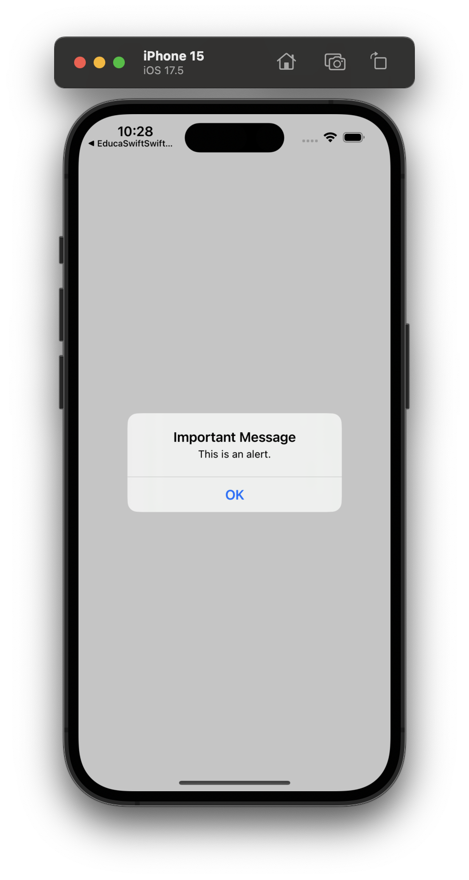
To show an alert, we need a @State variable to control its presentation. Then, we use the alert() modifier to configure it.
struct AlertExample: View {
    @State private var showAlert = false

    var body: some View {
        Button("Show Alert") {
            showAlert = true
        }
        .alert("Important Message", isPresented: $showAlert) {
            Button("OK", role: .cancel) { }
        } message: {
            Text("This is an alert.")
        }
    }
}
In this example:
@Stateis used to create ashowAlertboolean that controls when the alert should appear.- The
alert()modifier is attached to theButton. It accepts a title, buttons (like OK, Cancel), and an optional message.
Confirmation Dialogs
Confirmation dialogs, also known as action sheets, allow you to present multiple options to the user. This is useful when the user needs to choose from several actions or confirm a choice.
Creating a Confirmation Dialog
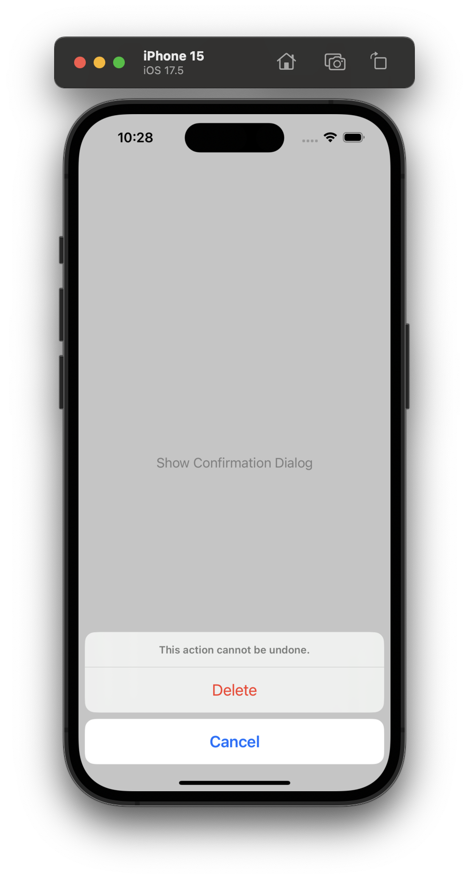
Similar to alerts, a confirmation dialog requires a @State variable to handle its presentation. The confirmationDialog() modifier is used to configure it.
struct ConfirmationDialogExample: View {
    @State private var showConfirmationDialog = false

    var body: some View {
        Button("Show Confirmation Dialog") {
            showConfirmationDialog = true
        }
        .confirmationDialog("Are you sure?", isPresented: $showConfirmationDialog) {
            Button("Delete", role: .destructive) {
                // Perform delete action
            }
            Button("Cancel", role: .cancel) { }
        } message: {
            Text("This action cannot be undone.")
        }
    }
}
In this example:
@Statecontrols when the confirmation dialog appears usingshowConfirmationDialog.- The
confirmationDialog()modifier is used to configure the dialog, including the title, buttons, and a message. - We can define different button roles, such as
.destructivefor critical actions like deleting.
Customizing Alerts and Confirmation Dialogs
Both alerts and confirmation dialogs can be customized with different buttons, messages, and roles. You can add multiple buttons with varying styles, such as .destructive for dangerous actions or .cancel for dismissals.
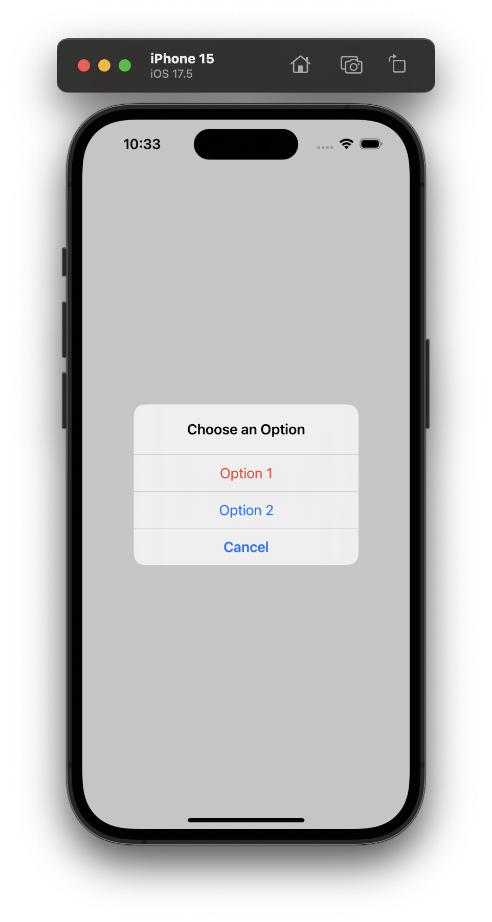
struct MultipleButtonsAlert: View {
    @State private var showAlert = false

    var body: some View {
        Button("Show Multi-Button Alert") {
            showAlert = true
        }
        .alert("Choose an Option", isPresented: $showAlert) {
            Button("Option 1", role: .destructive) {
                print("Option 1 selected")
            }
            Button("Option 2") {
                print("Option 2 selected")
            }
            Button("Cancel", role: .cancel) { }
        }
    }
}
In this example, the alert provides three buttons, each performing different actions. The .destructive role is used for critical actions, and the .cancel role is used to dismiss the alert.
Best Practices for Using Alerts and Confirmation Dialogs
- Keep it concise: The message in your alert or dialog should be short and to the point. Avoid overwhelming the user with too much information.
- Use appropriate button roles: Assign the right roles (
.cancel,.destructive) to buttons to improve clarity and user experience. - Provide feedback: If the alert or dialog triggers an important action (e.g., deletion), make sure to provide visual feedback to the user.
Be the first to comment